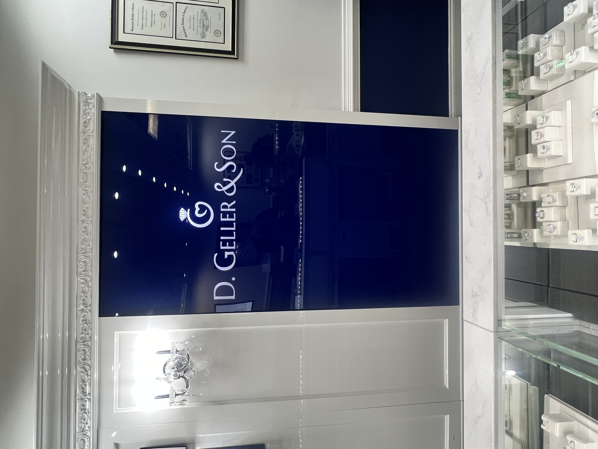
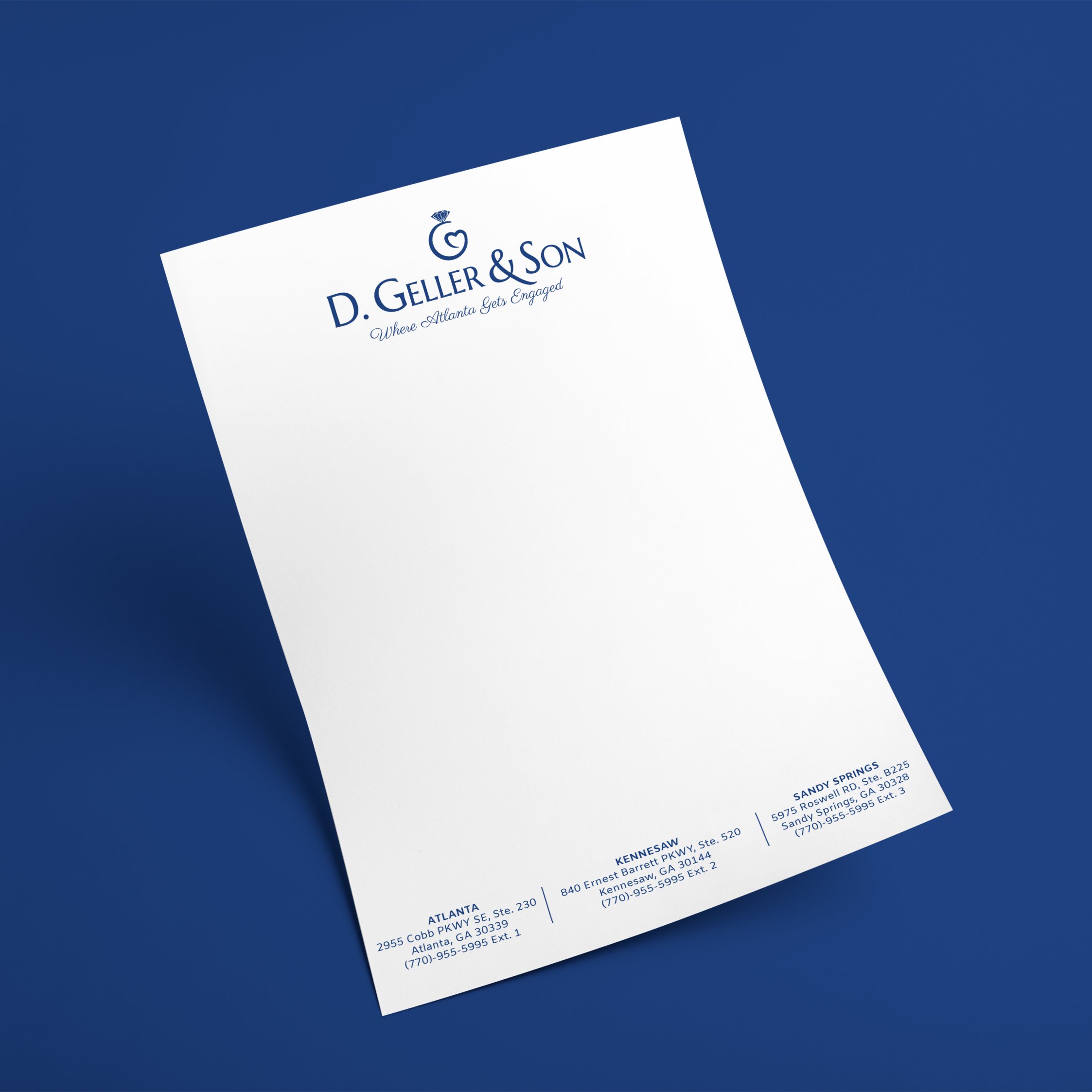
The Rebrand of D. Geller & Son
The owner's son initially conveyed that the original logo was intended to embody the letter 'G' in alignment with the Geller family name's representation, as well as a ring and a heart. Recognizing additional areas for improvement in the original design, I began sketching out a version that achieved all the symbolism he was after.
SketchinG
Here I wanted to figure out how to get the proportions of the overall ring as well the heart to come together to form a G. In the process of redesigning the icon, my primary goal was to achieve more consistent spacing among the diamond facets, aligning with the concept of precision and perfection. Additionally, I eliminated all rounded paths in the diamond to convey a sense of rigidity, in line from the inherent hardness of a diamond.
Final Versions
Use Cases
Orginal Versions
Goals: Symbolize a ring, a heart and a “G”. Make facets stronger.


